Regular visitors may have noticed: our logo, website, and documents have all gotten a completely new look and feel! The process started with the advise given to us by multiple student groups who, as part of their class in research methods, helped us evaluate how people perceive Maryosa. One of their recommendations was to re-design the logo and website.
Already in our Annual Report for 2020, we wrote about the first steps that had been taken towards a new logo. In the end, it was decided to officially commission Parsa to design a new logo for us. Parsa is a talented young man from Iran who is currently trying to cultivate his passion for design, which Maryosa is happy to support him in. Parsa offered us several options, including:
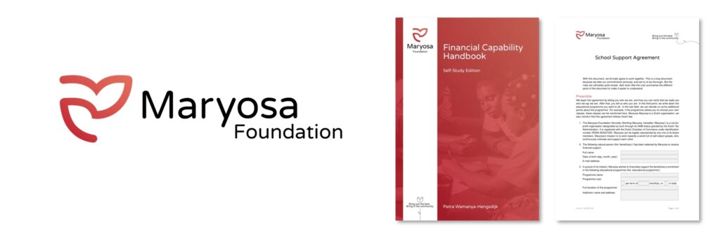
Out of the many great options offered to us, we chose the logo you now see at the top of this, and indeed every other page. We believe this logo really represents Maryosa, providing a hopefuly yet playful synergy between our symbolic rose, growth, and love. Thank you, Parsa!
We then used the inspiration we got from our new logo to redesign our documents as well. In particular the financial capability handbooks have gotten a complete makeover, but we also created new documents, such as our guide to receiving school support.
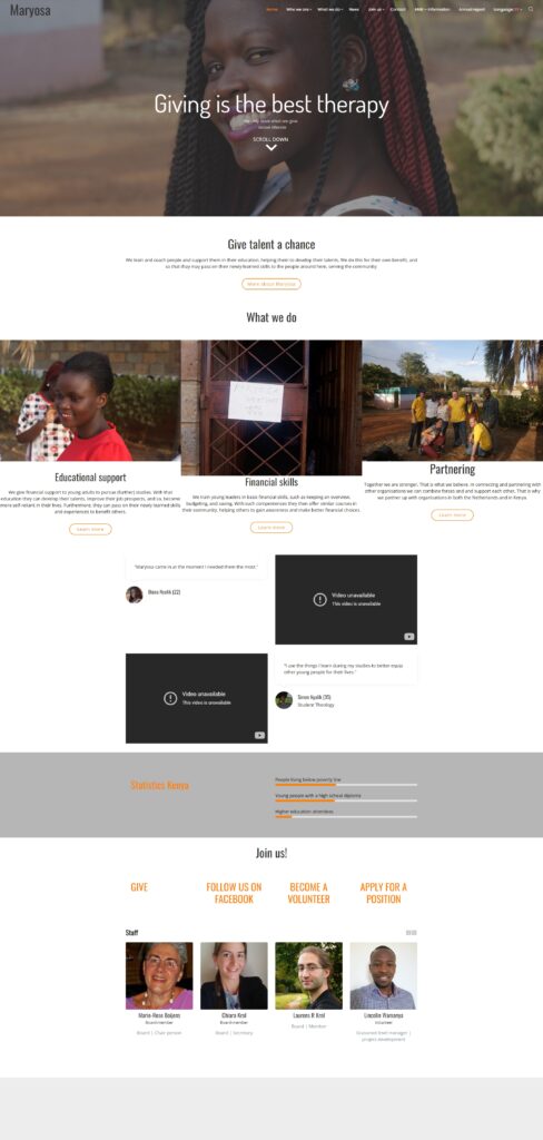
Finally, we also gave the website a whole new look. We hope you like it! As a final farewell, we leave you now with a last look at the homepage of our old website, created and operated by our volunteer Petra and kindly hosted by our partner KingdomIT.